In the 1950s economist Harry Markowitz developed Markowitz Portfolio Theory (
or simply Modern Portfolio Theory). Modern Portfolio Theory is a framework for selecting optimized financial portfolios.
Financial assets have various levels of risk and return.
Investors obviously prefer higher returns, but they also prefer to have lower risk.
Since there is a trade-off between risk and reward, financial portfolios
need to be considered on a risk-adjusted basis. Markowitz Portfolios are
the portfolios that maximize returns for a given level of volatility.
Together this group of optimal portfolios which have the maximum returns for
different levels of risk are called the efficient frontier. All of these portfolios
are efficient and investors may choose between them based on their risk tolerance.
Implementing this framework we build our own efficient portfolios and select two
famous Markowitz Portfolios
Building Portfolios
First, we randomly selected 25 components of the S&P 500 and
pulled their adjusted daily closes for the calendar year of 2019.
The closing prices were then used to calculate daily returns which
are then converted to annualized returns. These are the stocks we will
use to build our portfolios.
Next we randomly generate a set of 100,000 portfolios with random weights assigned
to each stock. For each portfolio we calculate the annualized return and the
volatility using the covariance of the component stocks.
The annualized return and volatility are the two core factors we need for selecting
efficient Markowitz Portfolios.
One common Markowitz portfolio is the Max Sharpe Ratio portfolio (MSR).
The Sharpe ratio is essentially the ratio found by dividing a portfolio’s return
by its volatility. The portfolio with the greatest Sharpe ratio is called the MSR.
And, the MSR is always Markowitz portfolio.
Another common Markowitz portfolio is the Global Minimum Volatility portfolio (GMV).
It is simply the portfolio with the lowest volatility.
The GMV is also always a Markowitz portfolio.
Below we find these two Markowitz Portfolios and compare them with
a uniformly distributed portfolio and the
S&P 500 as benchmarks. Let’s take a look at the results.
Simulation Results
Graphing the simulation results can be quite informative. Here we have a scatterplot of the 100,000 portfolios, with volatility on the x-axis and returns on the y-axis. The colour is mapped according to the portfolios Sharpe ratio. Since investors prefer low risk and high returns, the direction of increasing preference points towards the top left corner.
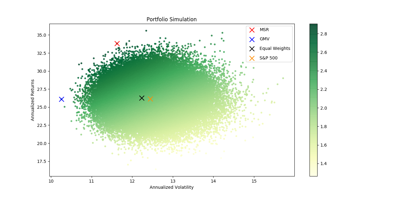
We can see the MSR and GMV are both towards the upper left corner as expected. This upper left
edge is the efficient frontier where all the Markowitz Portfolios lie.
Since the MSR and GMV are optimal portfolios we know they have the maximum
return for a given level of volatility. In other words, for both the MSR and GMV
there exists no portfolio which gives the same return with lower risk,
nor any portfolio which has greater return with equal risk.
The equally weighted portfolio and the S&P 500 benchmarks both lie near the middle of the group.
We can easily see that these are in fact inefficient portfolios.
There are many other portfolios availiable with lower risk and equal return (directly to the left)
and portfolios with higher return and equal risk (directly above).
All of those portfolios are preferable.
| Portfolio | Annualized Return | Volatility | Sharpe Ratio | |
|---|---|---|---|---|
| Max Sharpe Ratio (MSR) | 33.81 | 11.63 | 2.91 | |
| Global Min Volatility (GMV) | 26.1 | 10.26 | 2.54 | |
| Equally weighted | 26.28 | 12.24 | 2.15 | S&P 500 | 26.16 | 12.45 | 2.1 |
Notice that the MSR portfolio had greater returns and lower variance compared to the benchmarks. The GMV also garnered approximately the same returns as the benchmarks but also had significantly lower volatility. Last, lets chart the time-series of our optimal portfolios against the benchmarks.
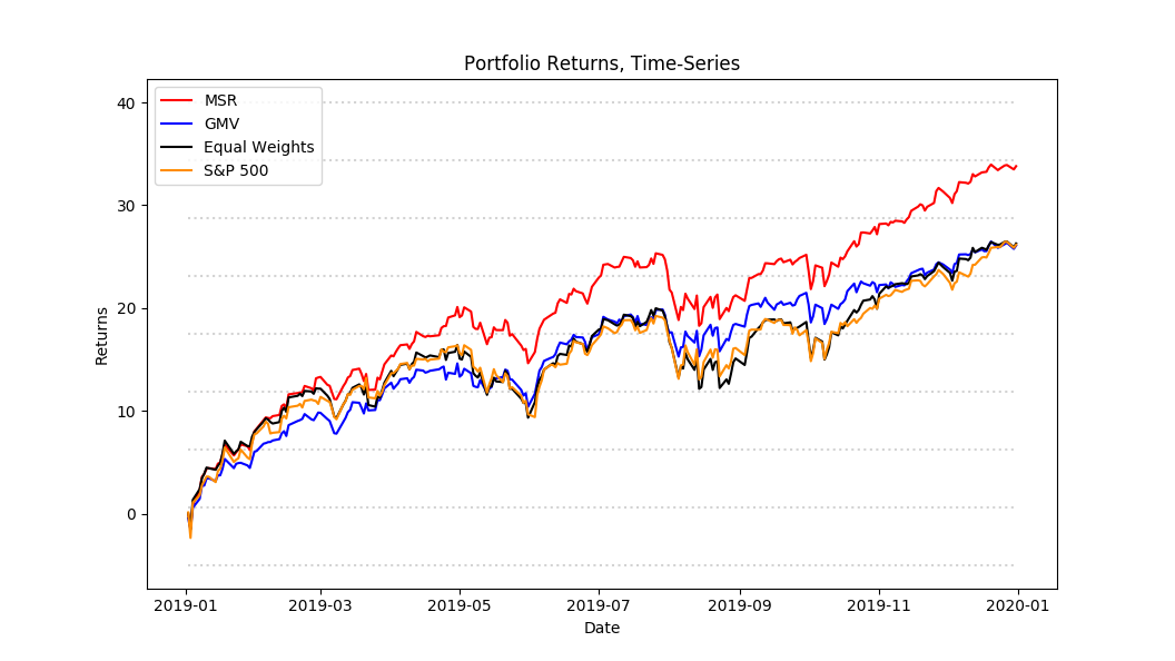
With further visual inspection we can verify some of the intuition we built above. We can easily see the excess returns earned by the MSR portfolio compared to the GMV and benchmarks. Using the time-series graph to compare volatility is more difficult, but we can to an extent notice the lower volatility of the GMV. We can also easily see the similarity in the shapes of the graphs, sharing peaks and troughs. This makes sense since the portfolios are after all S&P 500 components so the performance should be similar.
Technologies used:
- Python, NumPy, Pandas, Matplotlib
- Jupyter Notebook
Data:
- S&P 500 component data sourced from Yahoo finance.
Updates:
- Sept 26th, 2020: Added time-series chart and description.